In 1996, I was an apprentice at a design boutique in Los Angeles where it was my job to work closely with printers in developing film, mixing colors and supervising the press. It was surely not the most prestigious position, but that time spent absorbing the ins and outs of the design business supplied the knowledge and fostered a love for the work I do today.
To my own delight, I found the print shop to be a romantic playground. With its distinct scent of fresh ink on uncoated paper and an industrial aesthetic that required a skilled touch, the print shop was at once rough-around-the-edges yet also an infinitely charming place to work. To this very day I relish all the little details inherent to the printing process.
Nowadays, I particularly enjoy going to press checks, especially when the project runs on an older model of a two-color Heidelberg offset press. The set up on these machines still requires artisanal mastery, which offers a rare glimpse of a dying ritual.
Offset printing is a method where an inked image is first transferred from a plate to a rubber blanket, before meeting the paper surface.
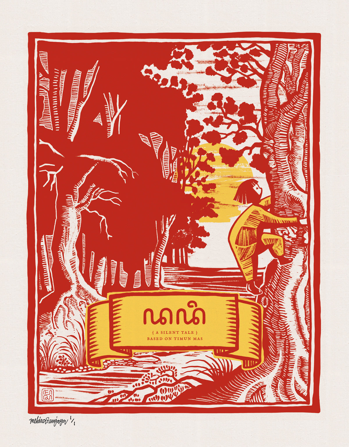
We used this method of printing for my most recent illustrated motif edition, called ‘Pacific Tides’ (issuing number: 1403).

Before we could see the first run of prints the lead printer Subandi and his assistant Syahril spent a good hour cleaning and adjusting the printing press.
There is a certain innate pride that comes with knowing the process and all its secrets that these passionate and meticulous printers savor in their profession.
It is an industry standard to work with Pantone color swatches. Each swatch has a corresponding mixing chart for the printers’ reference. I like to be present during this phase, so that I can convey to the printer my personal preferences with regard to the final ink mixture.
The ink needs to perfectly match a specified Pantone color swatch. For this to occur there are lots of details that have to be taken into consideration. The final impression also depends on the paper’s characteristics: uncoated, coated, recycled or tinted stock.
The mixing is done manually. With a keen eye and a spatula, the perfect color is deftly attained.
For the initial set up alone, between 100-150 practice prints (known as make ready sheets) have to be prepared for the preliminary adjustments and proofing. Once that is achieved the final settings of the print impression are approved.
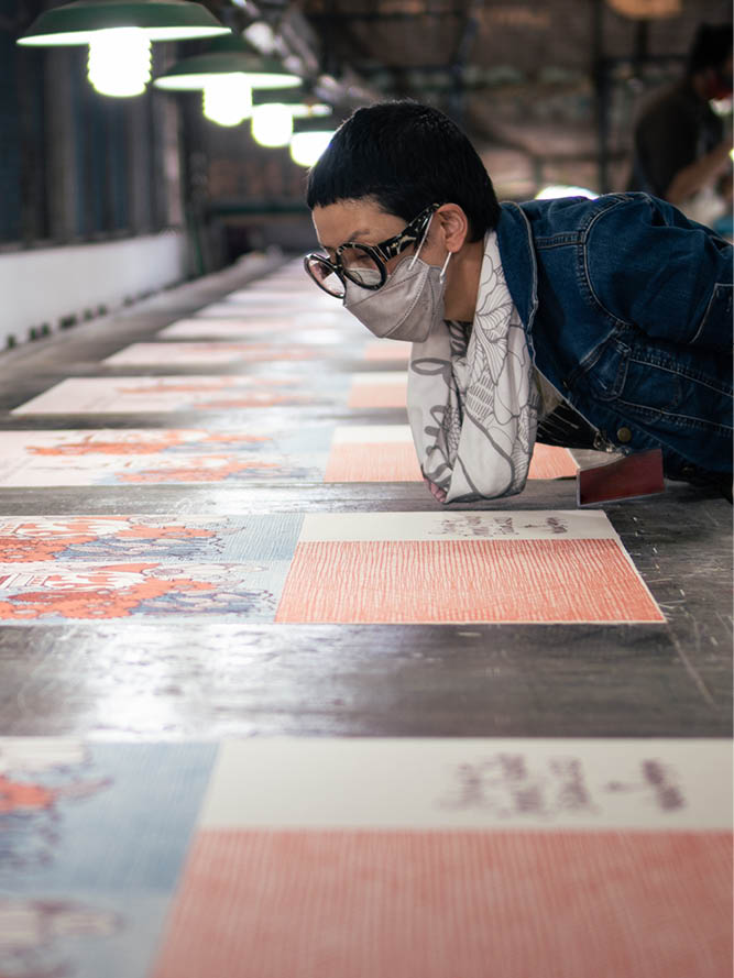
As I supervise this printing process I check the following: (1) the clarity of the plate compared to the original film (it should be dust free), (2) the uniformity of the print impression across the paper, (3) how the ink reacts to the final paper stock (especially on tinted paper), (4) the intensity of the color, (5) the registration precision, and (6) cropping positions. I love getting lost in these fine points, making sure everything is flawlessly aligned.
Adjusting pressures on the press can change the density of the color. The more pressure that is applied, the more intense/darker the color can become. I use a loupe (a type of magnifying glass) to check that the pressure does not create ‘feathers’ around the edge of the motif.
During color correction, it is important to check the result under controlled lighting.
These control panels allow the press to create various pressures across the print surface to adjust the intensity of the ink.
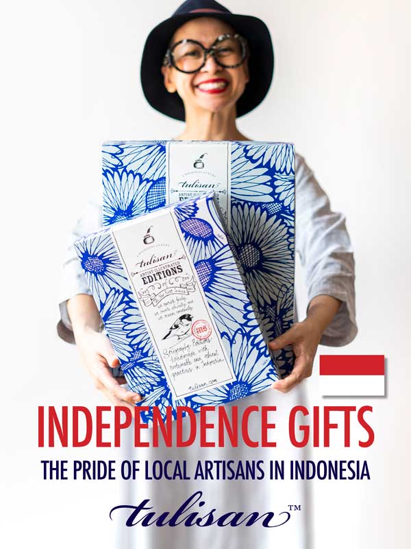
And that’s a wrap! These carefully crafted wrapping papers (size: 50 cm x 70 cm) are sure to charm whomever they meet. Stop by Tulisan in Darmawangsa Square, Jakarta to purchase and see what else we have in store for you.
Triple kisses, Melissa Sunjaya


